JILL TURNBULL
MY ROLE
Branding & Identity
Branding & Identity
Art Direction
Web Design
Photography
Photo Editing
Packaging Design
Set Design & Styling
Jill Turnbull is an Australian clean beauty company specializing in organic, multipurpose, plant-based self care products. The founder engaged me in a 7-month contract as a creative director to reimagine the company’s visual identity, art direction, digital branding, and website design.
As the sole creative on a small team, I directed, shot, and edited all key visuals and product photography, oversaw the corporate identity, developed packaging and collateral, and redesigned the website, using a consistent visual language that reflected the clean, simple, environmentally conscious core values of the company.
As the sole creative on a small team, I directed, shot, and edited all key visuals and product photography, oversaw the corporate identity, developed packaging and collateral, and redesigned the website, using a consistent visual language that reflected the clean, simple, environmentally conscious core values of the company.

HOMEPAGE
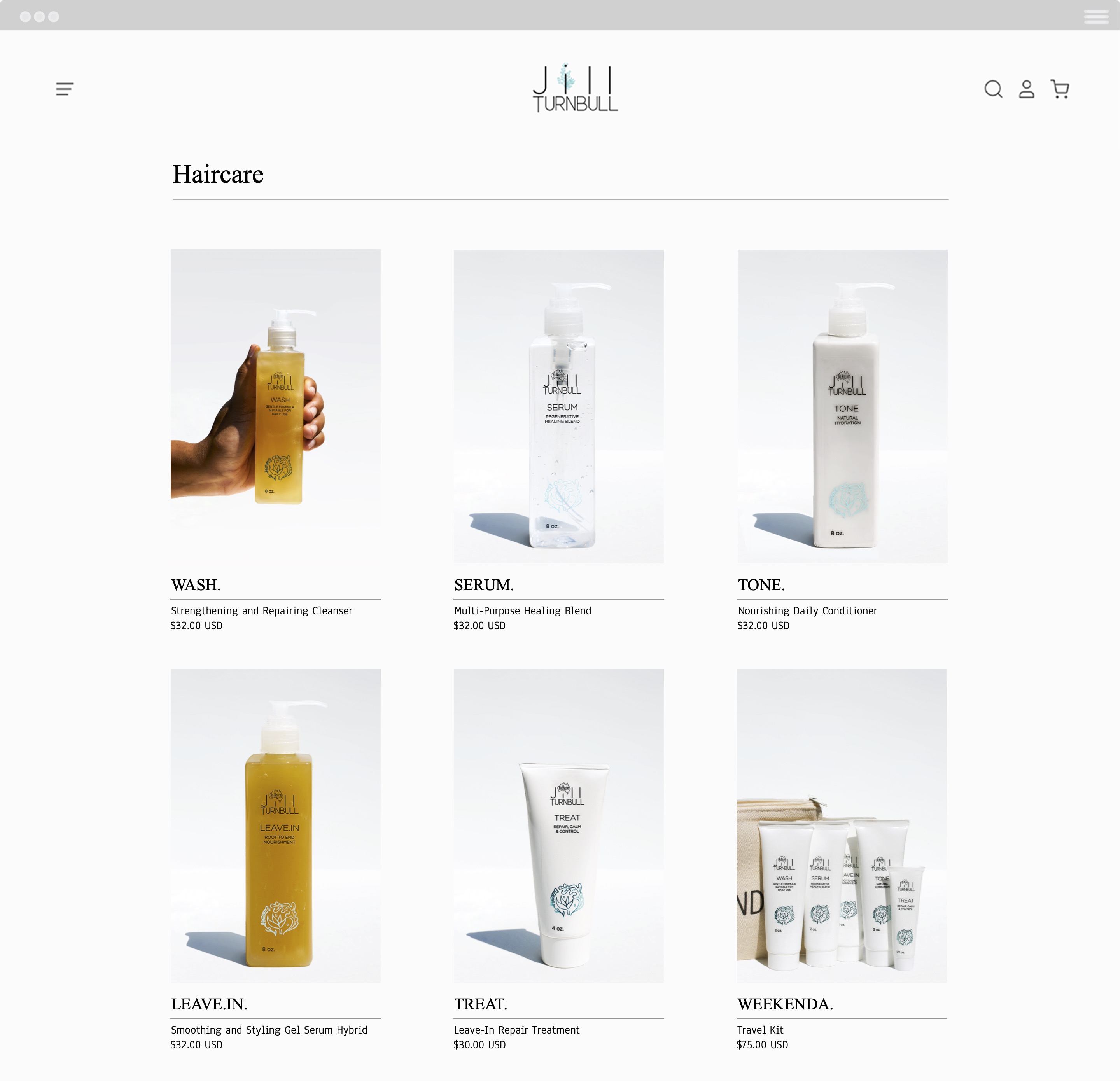
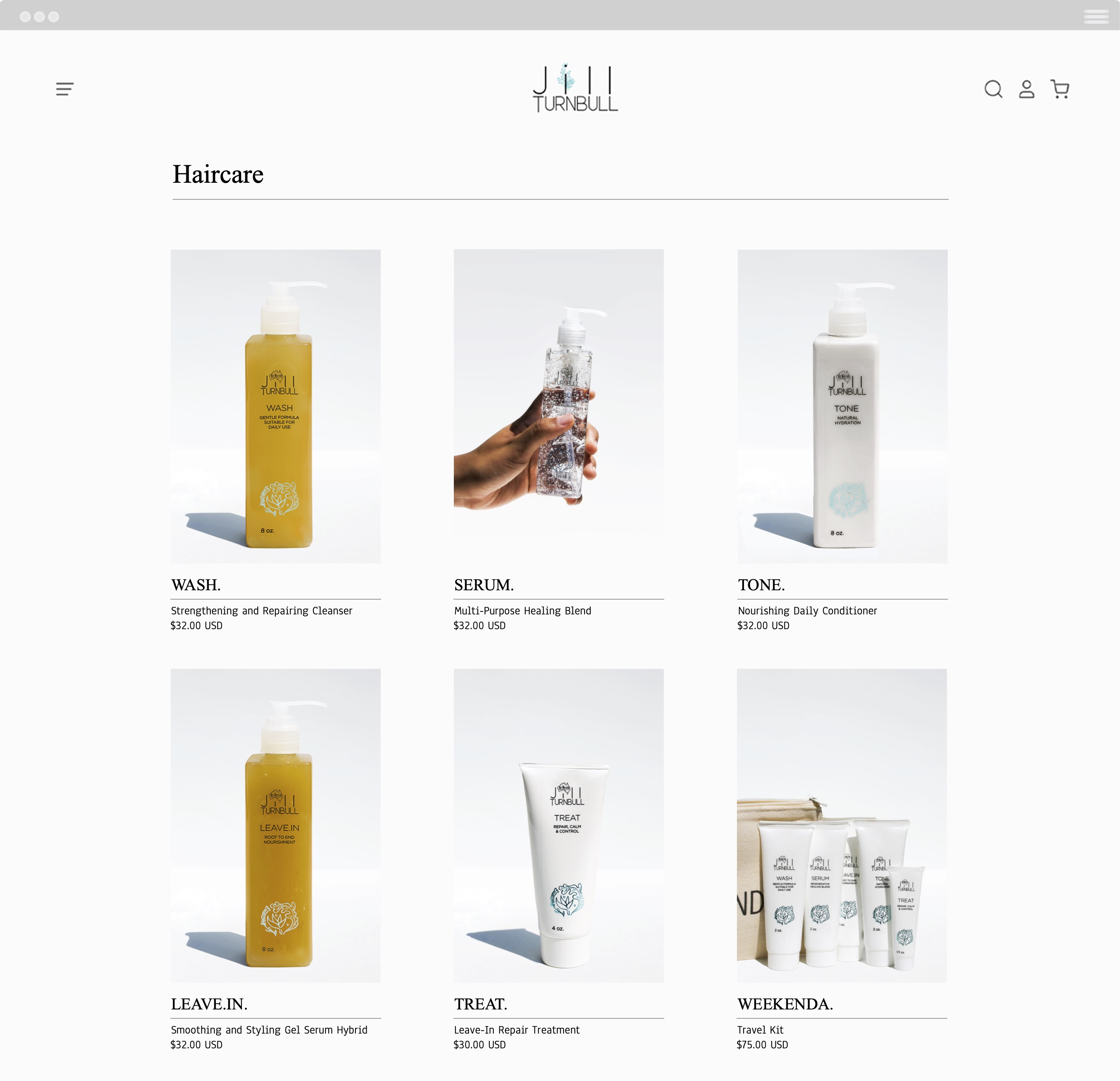
The new website interface is clean and minimal, a reflection of the brand’s no-frills approach to plant-based self care, and features generous white space to draw focus to the unique diptych collages and refreshed product photography.


LOGO
The client wanted to maintain the previous logo’s typeface and general look while still refreshing its design for the following year.
The new simplified logo features a hand illustrated golden wattle, the national flower of Australia, which serves as a simple but effective visual reference to the brand’s origins inspired by the lifestyle and environment of the founder’s home country.
The new simplified logo features a hand illustrated golden wattle, the national flower of Australia, which serves as a simple but effective visual reference to the brand’s origins inspired by the lifestyle and environment of the founder’s home country.



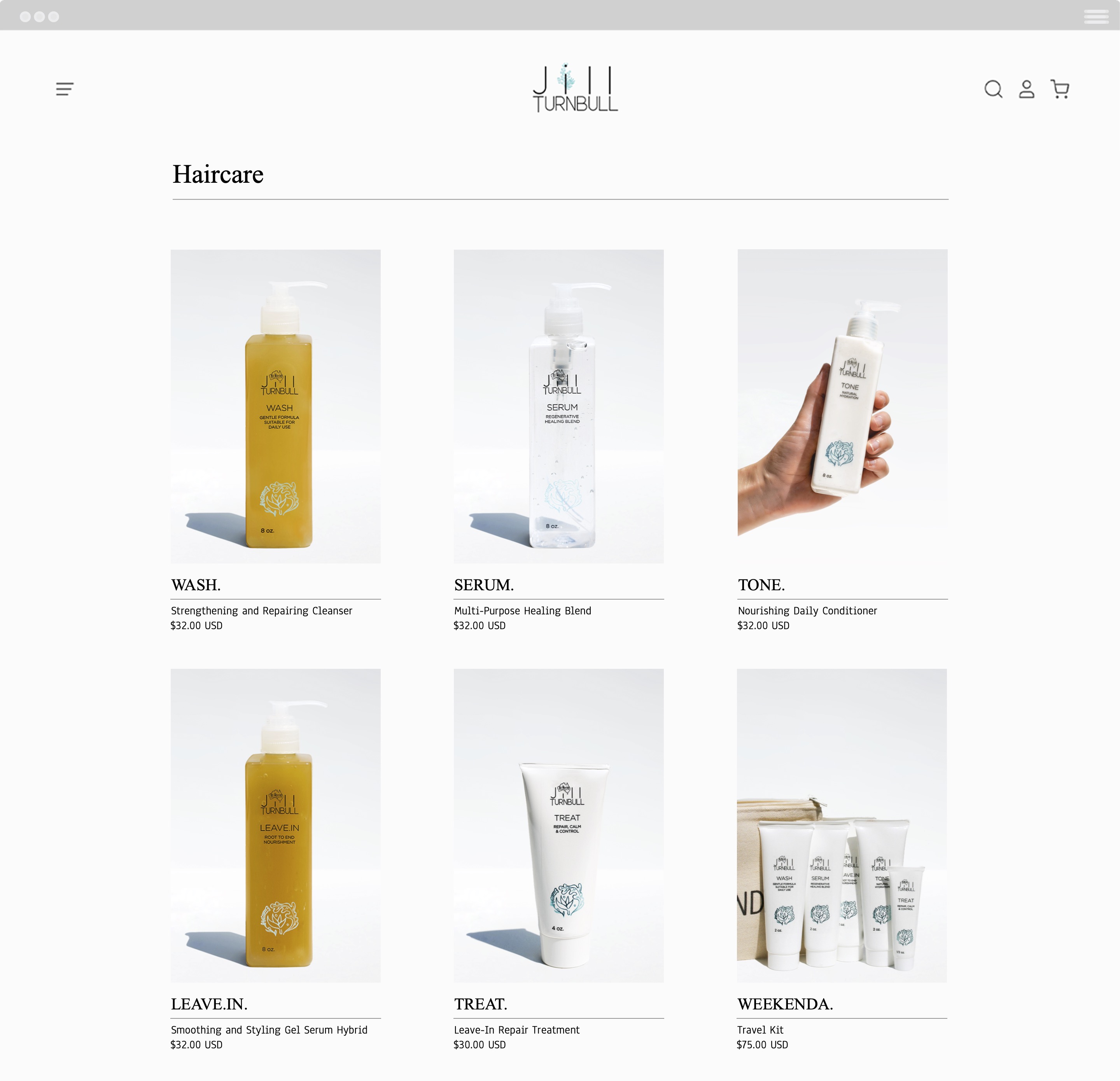
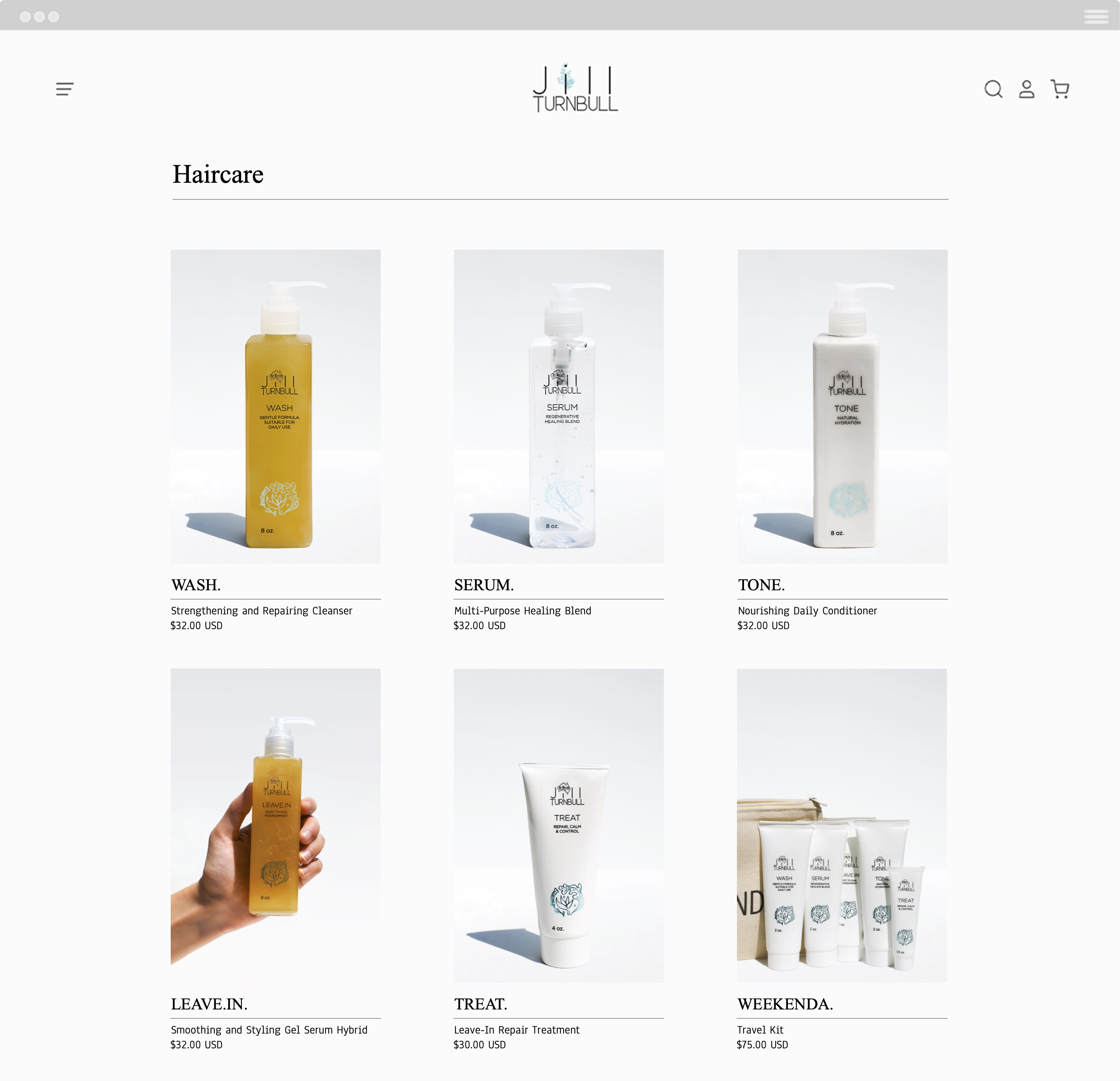
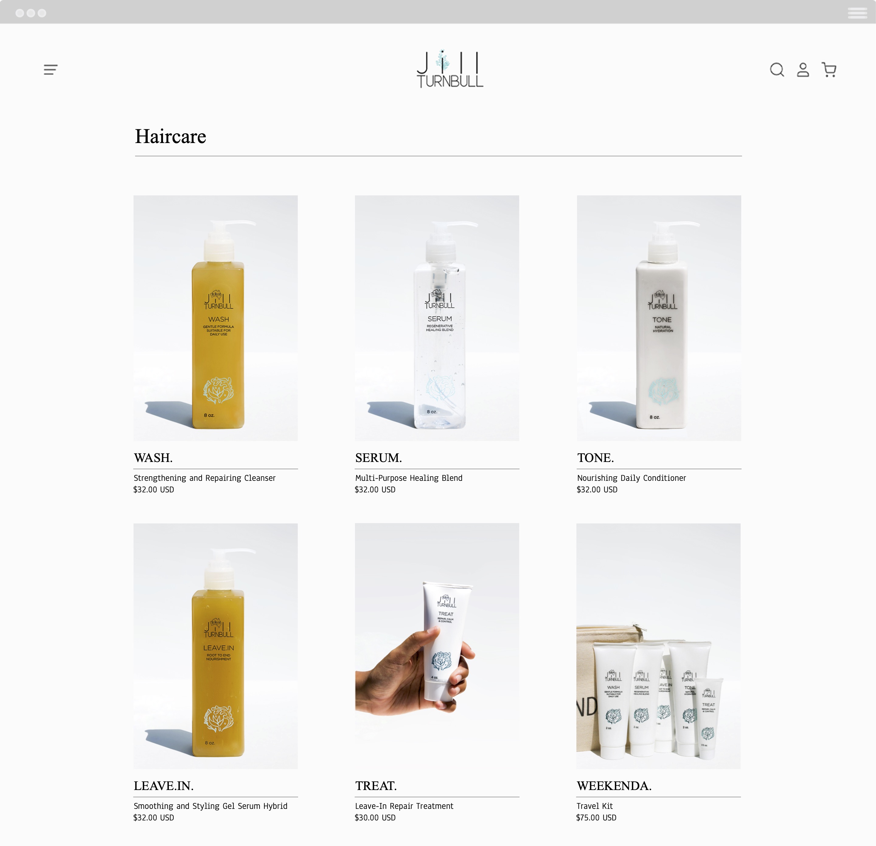
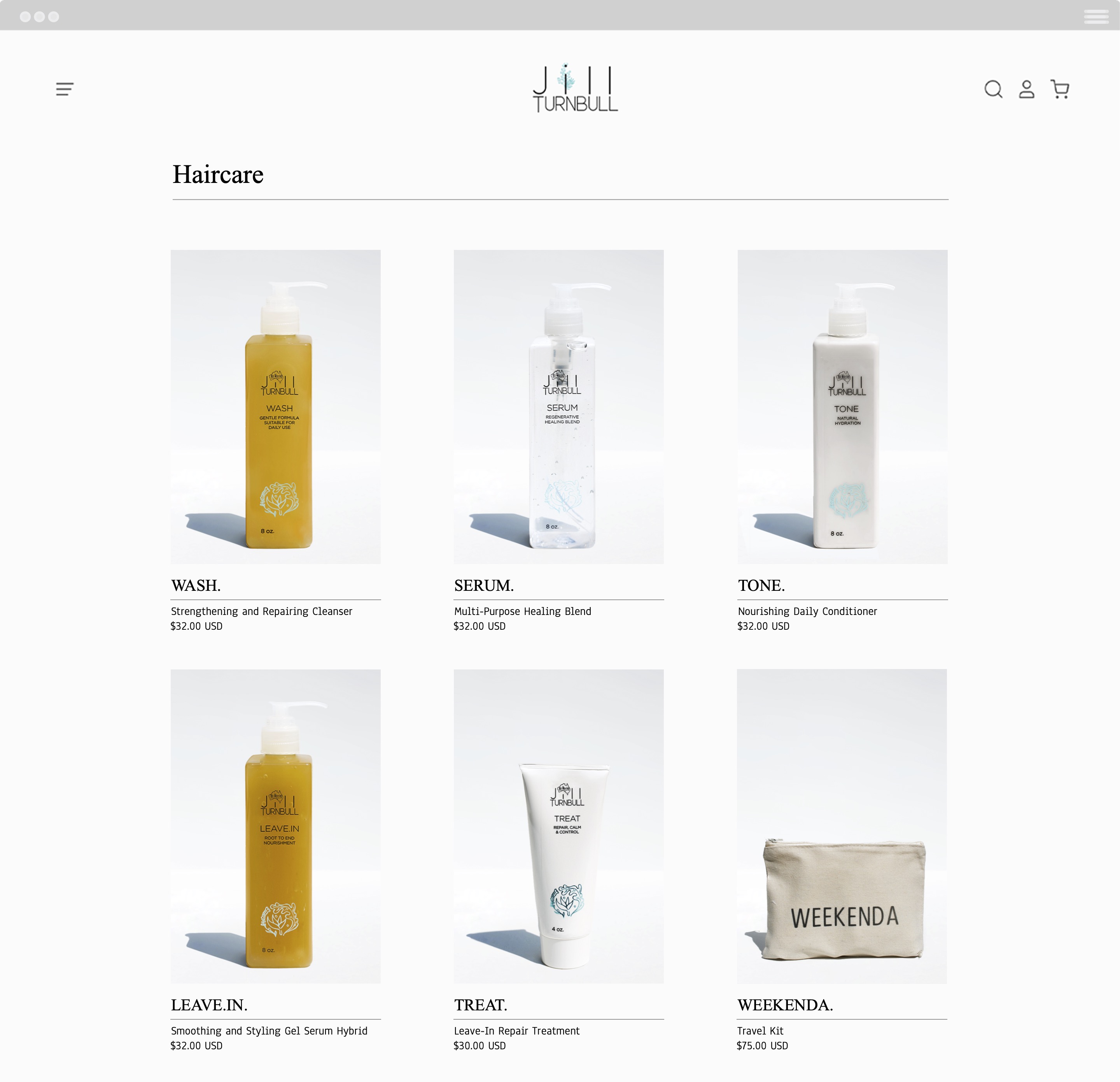
PRODUCT GRID
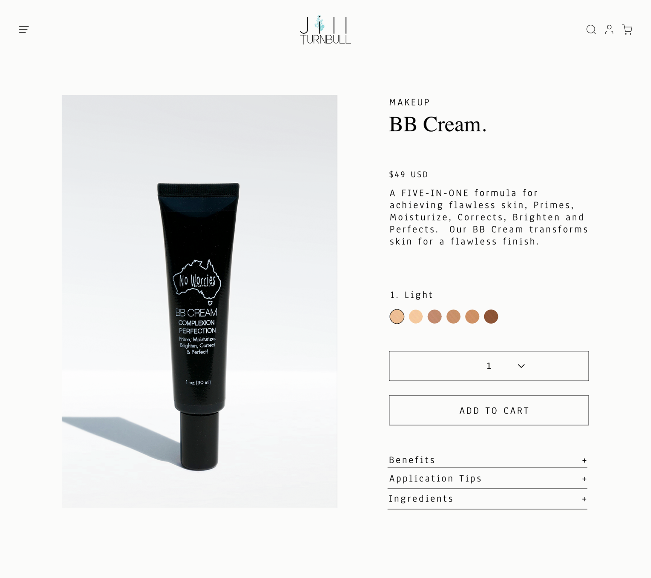
PRODUCT PAGE
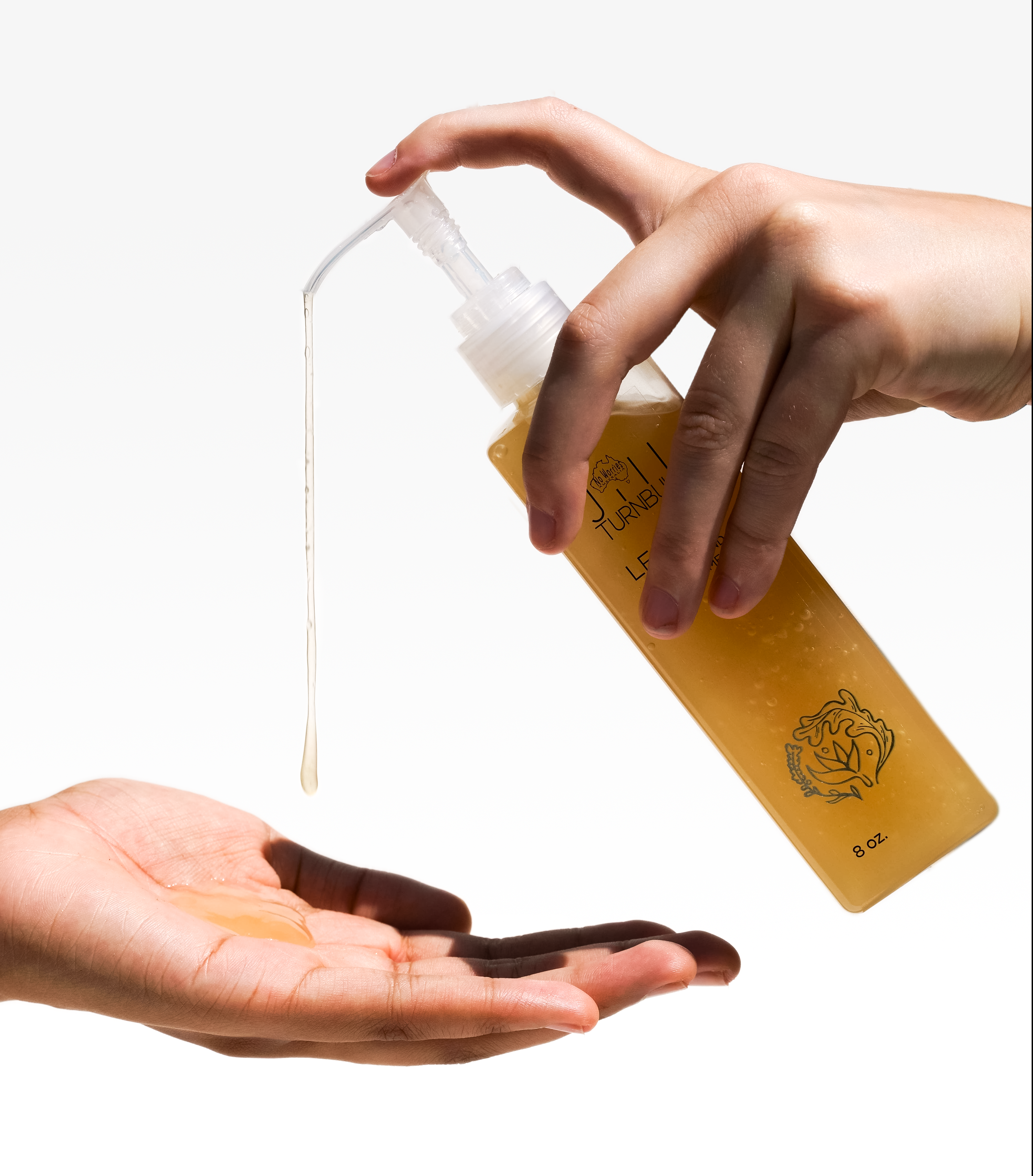
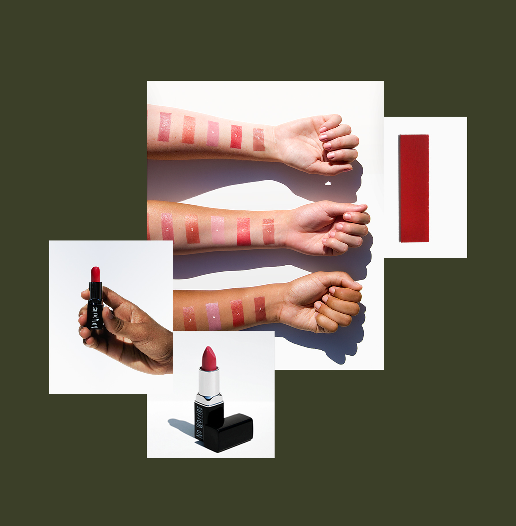
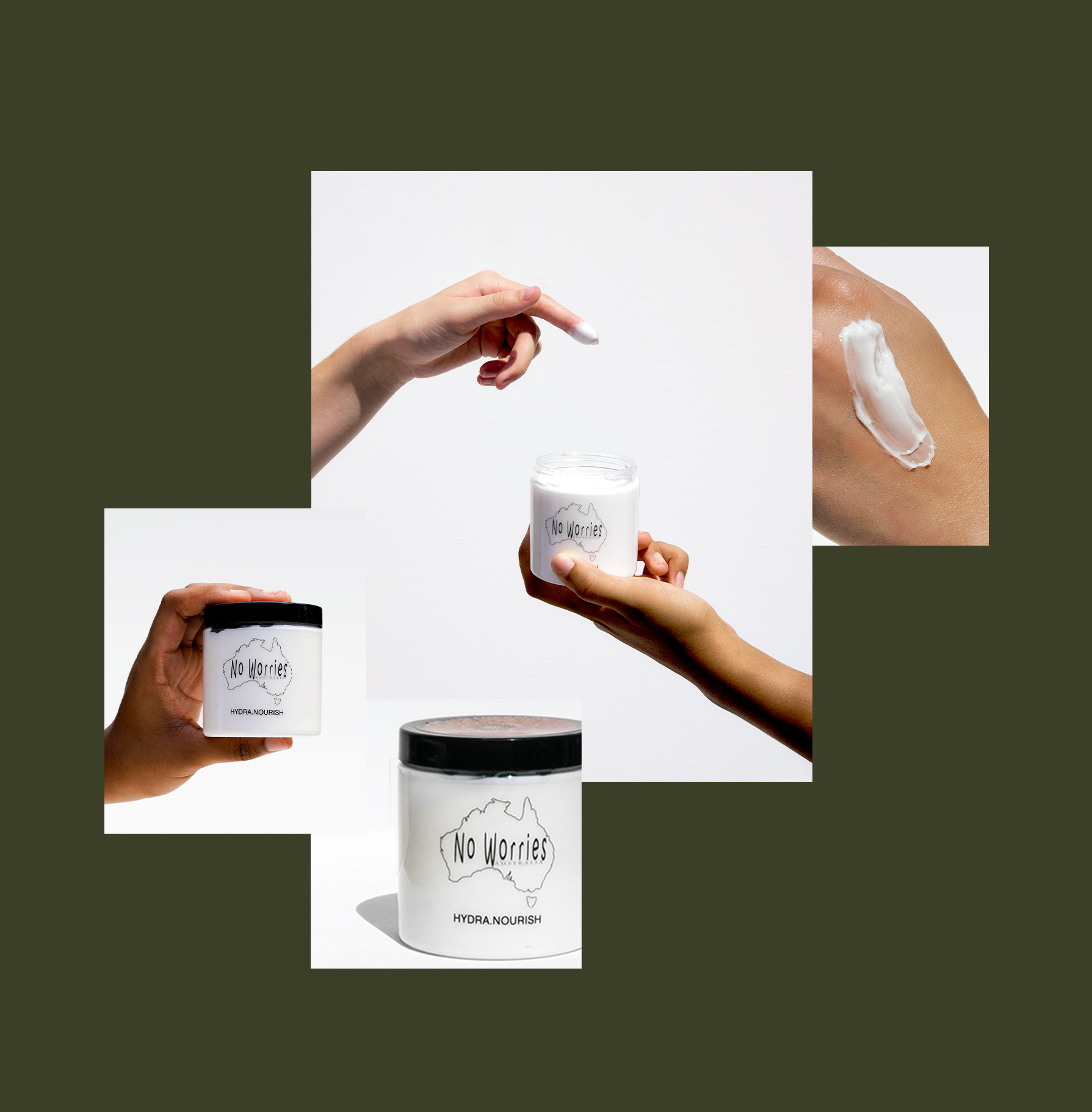
New product photos, swatches, and model shots were created to illustrate the size, color, and texture of all 150 product variants.




RECIPE GUIDE
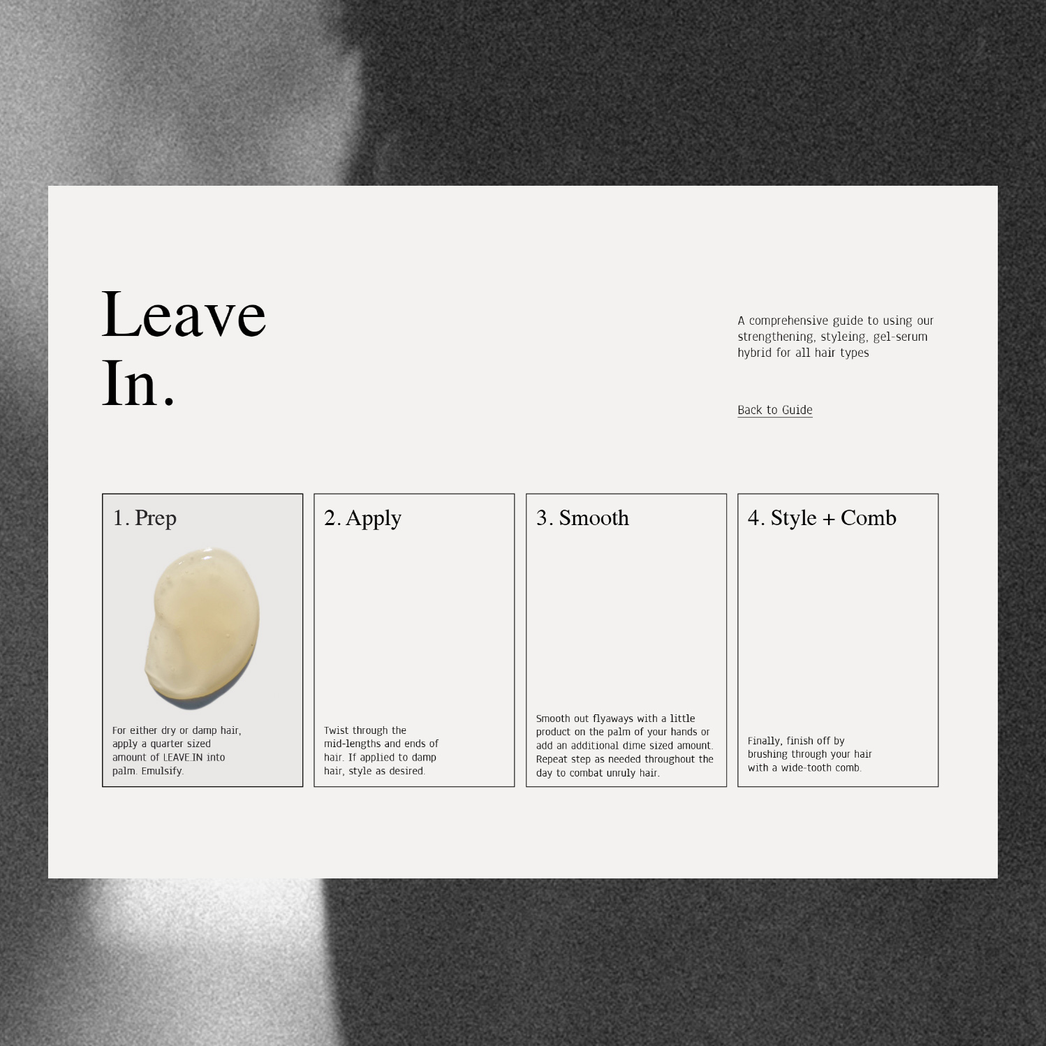
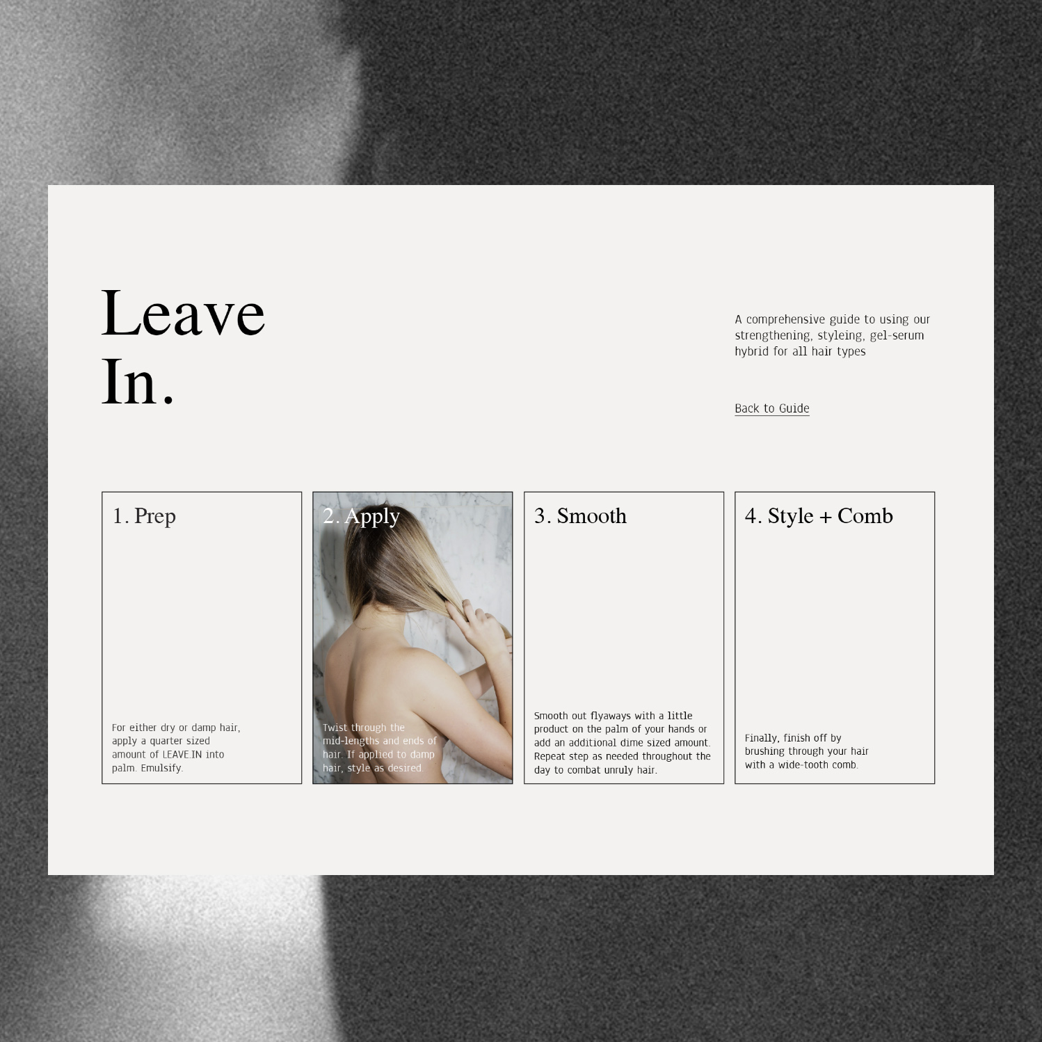
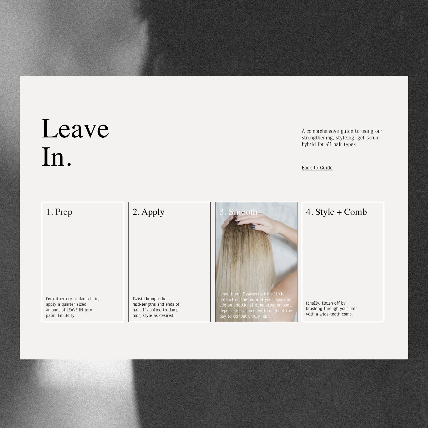
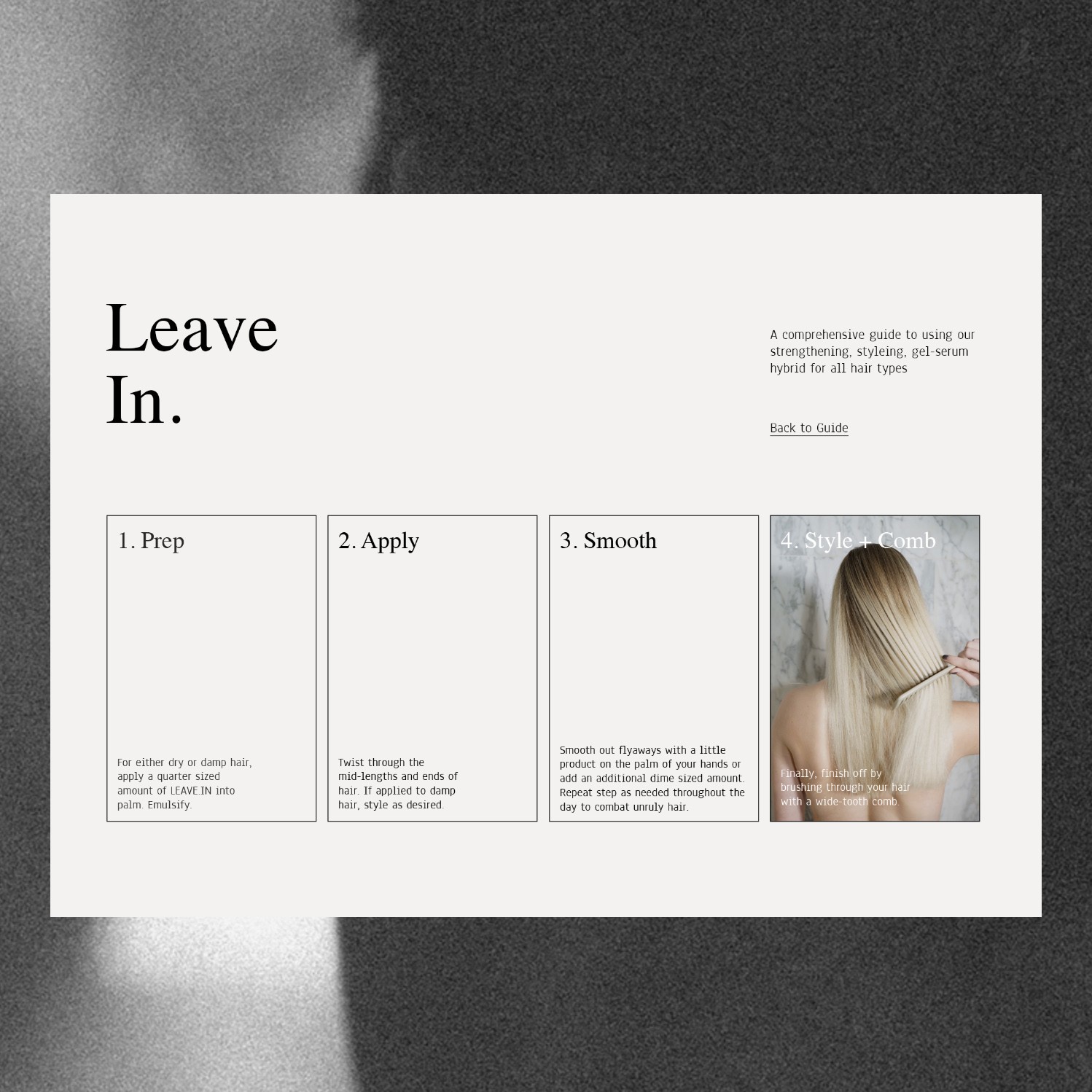
Each product has multi-purpose functionality or is designed to be used in tandem with another product, making descriptions and recommended pairings, initially tacked on the product page in the “How to Use” section, potentially confusing to the consumer. I proposed using the intersectionality of products as a key benefit, presenting the entire product line as a customizable “Mix and Match” system with intuitive visual recipe guides.

GIFT CARDS + PACKAGING
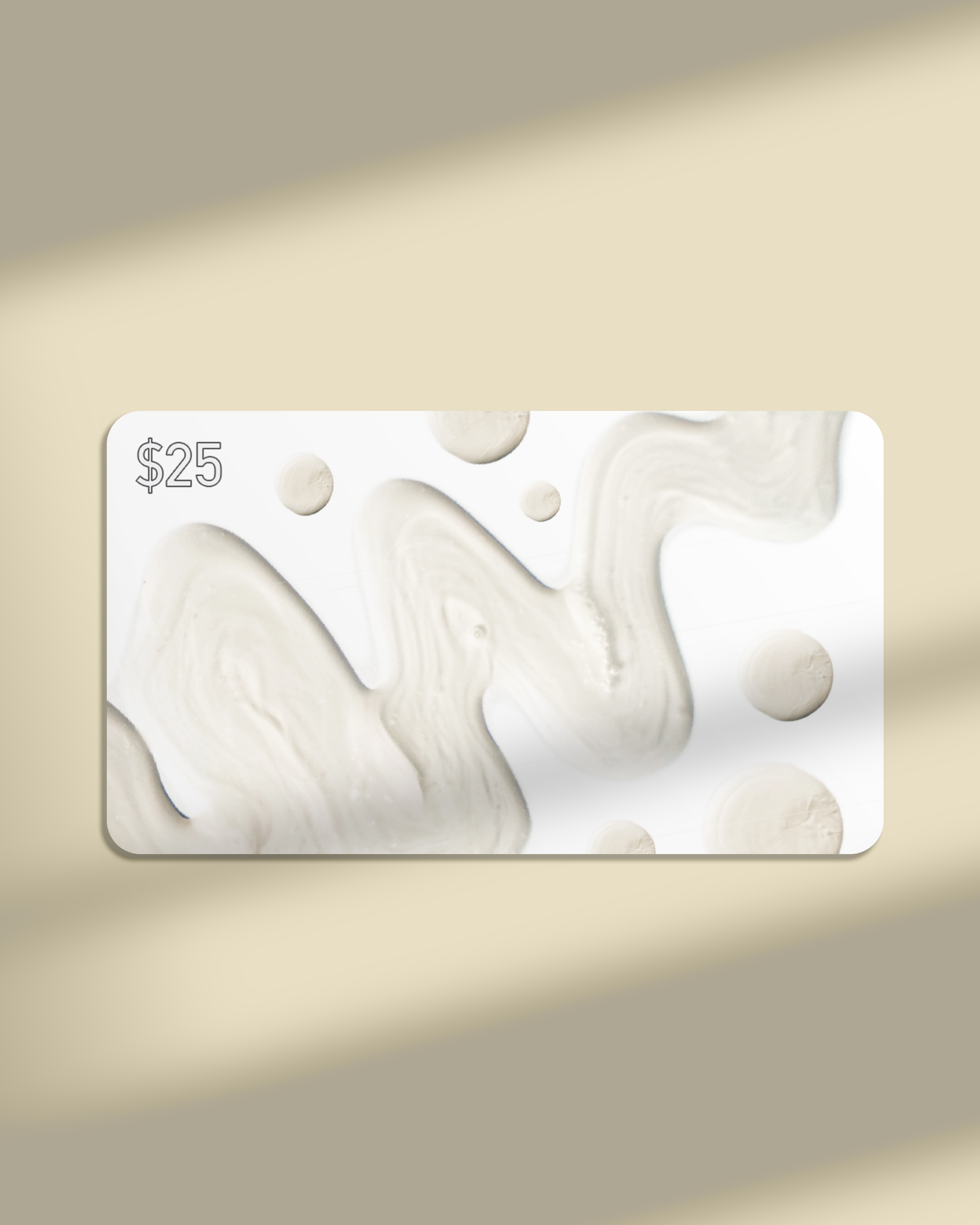
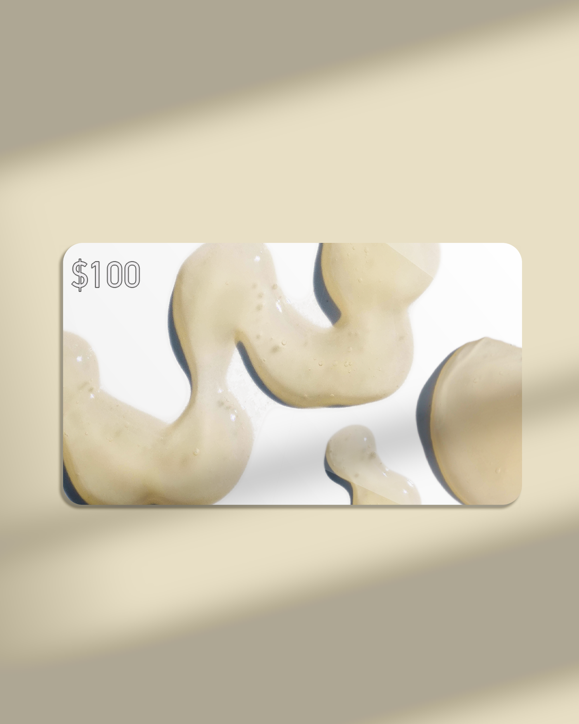
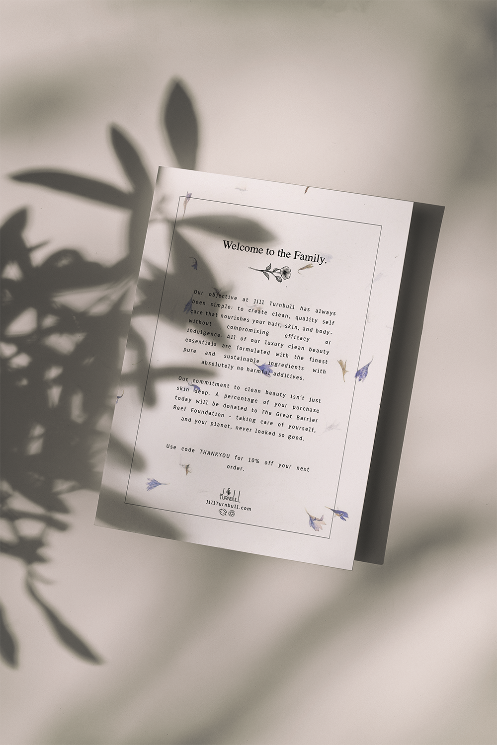
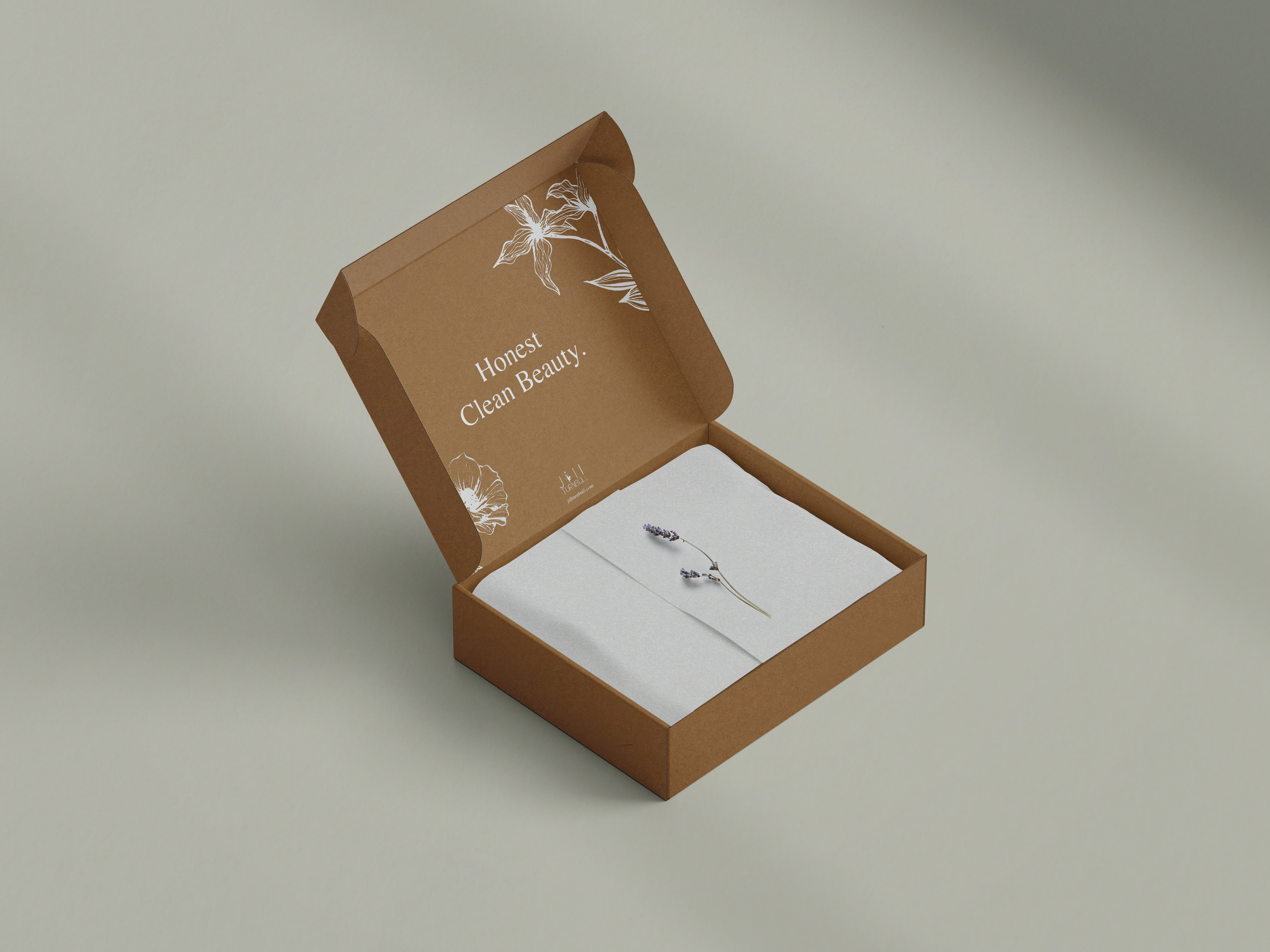
E-Gift cards featuring selected swatch designs were created along with new print packaging materials. A welcome insert card, printed on seeded cornflower paper, is now included with every shipment.
Stamp illustrations and text were produced to reduce sticker waste
and add a personalized touch to the previously blank mailer boxes.
Stamp illustrations and text were produced to reduce sticker waste
and add a personalized touch to the previously blank mailer boxes.
